Which one is better? Price range design
Which price range design do you think is better? There are endless possibilities to format your price range design. As a designer, it is sometimes difficult to decide; which design is actually better? Designs can sometimes be very similar but the impact how a user views and use them can be very different.
Price range designs
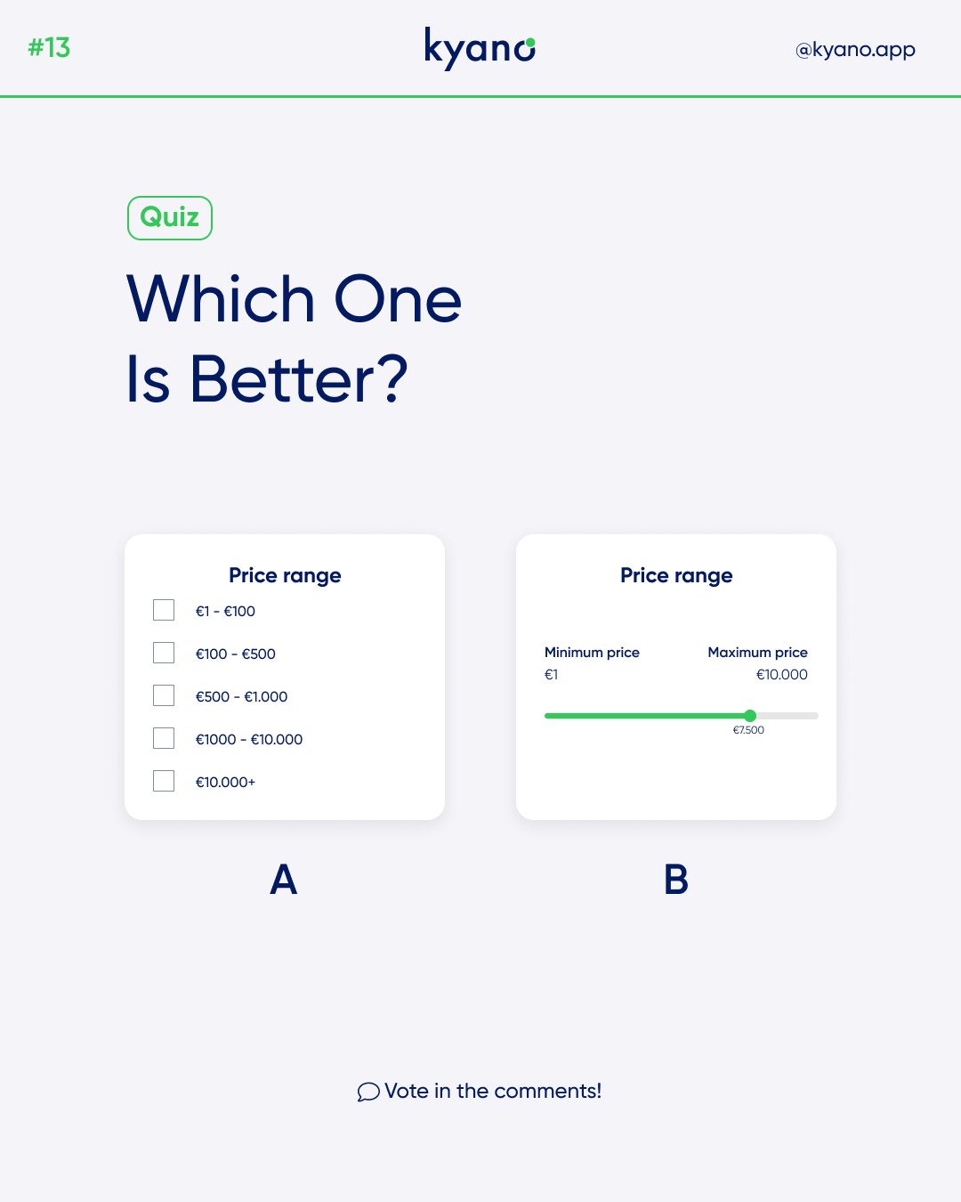
In this example, we have two different price range designs; selection list or a slider.
With a selection, you let the user choose between certain values. These values, in this case euros, run from low to high. With a click, the user can check his preference among the choices.
Sliders allow users to view and select a value (or range) from the range along a bar. They’re ideal for adjusting settings such as volume and brightness, or for applying image filters.
Sliders can use icons on both ends of the bar to represent a numeric or relative scale. The range of values or the nature of the values, such as volume change, can be communicated with icons.
The answer:
So which prince range design is better? Actually, there’s no wrong answer. The design for a price range depends on what kind of website it is and what products are being sold. It is also a matter of preference! But with a slider you give the user more freedom in choosing the amount of money he wants to spend on the website.
Want to learn more of about design choices? Check out our Instagram for more such tips and tricks.
Or check this post about pass word design.


