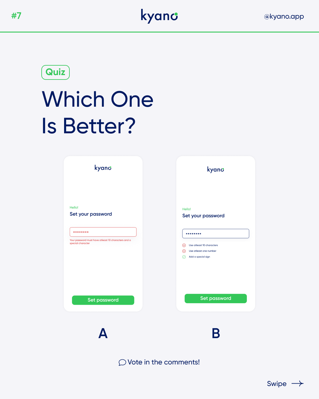
Which one is better? Password design
There are endless possibilities to format your password design. With your design you can help your user to use your software correctly, such as when entering a password.
Password design
Password fields are a necessity if you’re designing a login or sign-up form for your application. As common as these types of fields are, they can be frustrating to interact with when poorly designed. It is important to state the password requirements, and make sure that the user can see them the entire time that the field is selected. If you can successfully reduce some of the technical restrictions, you’ll have less text to display and fewer rules for the user to process, making password creation faster.
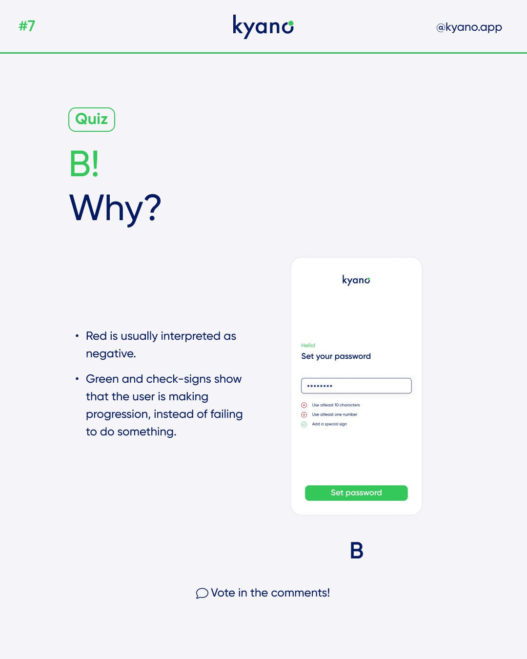
In this example design B is better. In this format you better show the user what the progress is of using the software. In the B design, the user can see what conditions the password must meet to successfully complete the login or account creation process. The colors (green and red) are also important when designing this. The color red is associated with error or that something is not yet completed. Green is associated by humans with satisfaction, an action has succeeded.
Take these tips password design in consideration when creating a form. If you want to learn about password creation itself in more detail, here’s a great article we recommend: Password Creation: 3 Ways To Make It Easier.
Or check out our other article about password design.