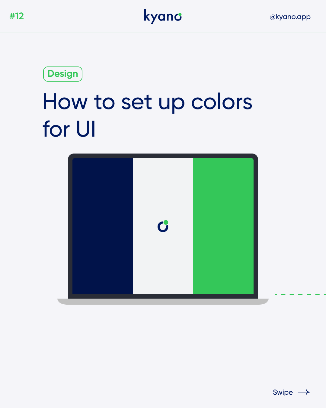

How to set up colors for UI
Colors for ui
How to set up colors for UI
Start with Primary Color
Choose primary colors according to the kind of application you’re designing. Every color has a different phychological meaning associated with it. For this article we take blue as our primary color.
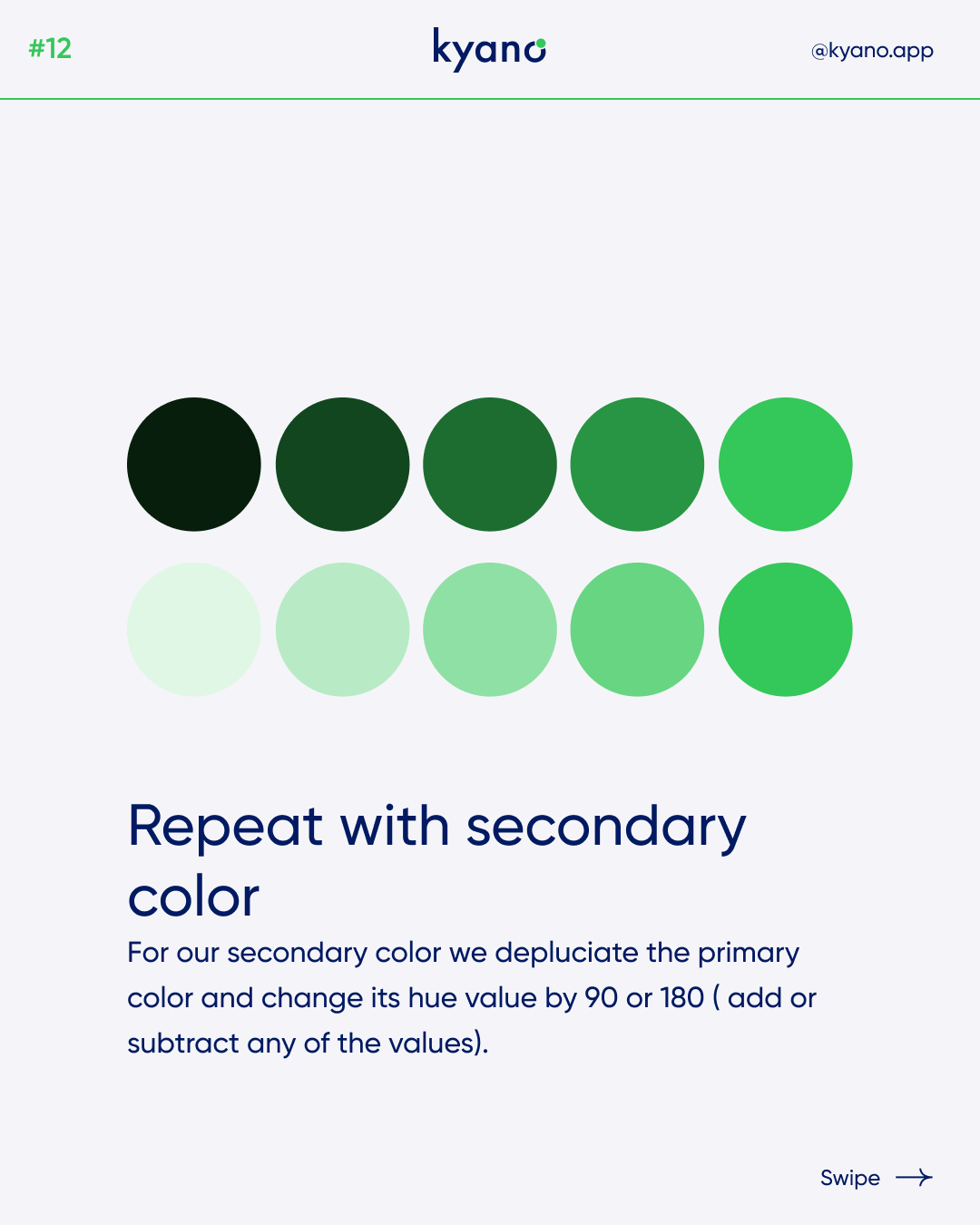
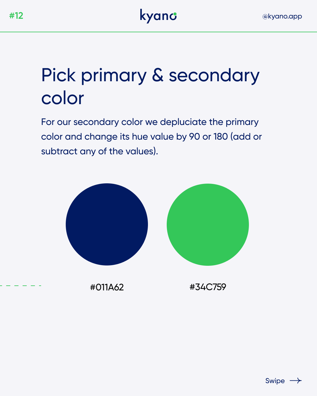
Create Secondary Color
For our secondary color we depluciate the priamry color and change its hue value by 90 or 180 ( add or subtract any of the values)
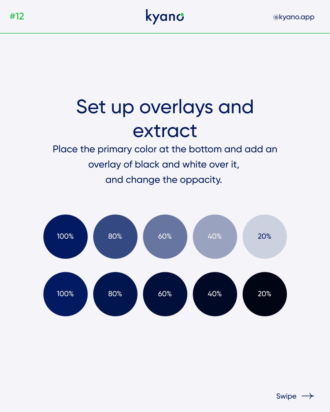
Setup Color Overlays
Place the primary color at the bottom and add an overlay of black and withe over it, and change the oppacity.
Extract The Colors
Pick all the colors with the Eye Dropper tool and give them to your elements.
Repeat with Secondary Color
Choose Indicator Colors
Pick any Red, Green, Yellow or gray color which works with yhe background color (in terms of contrast).
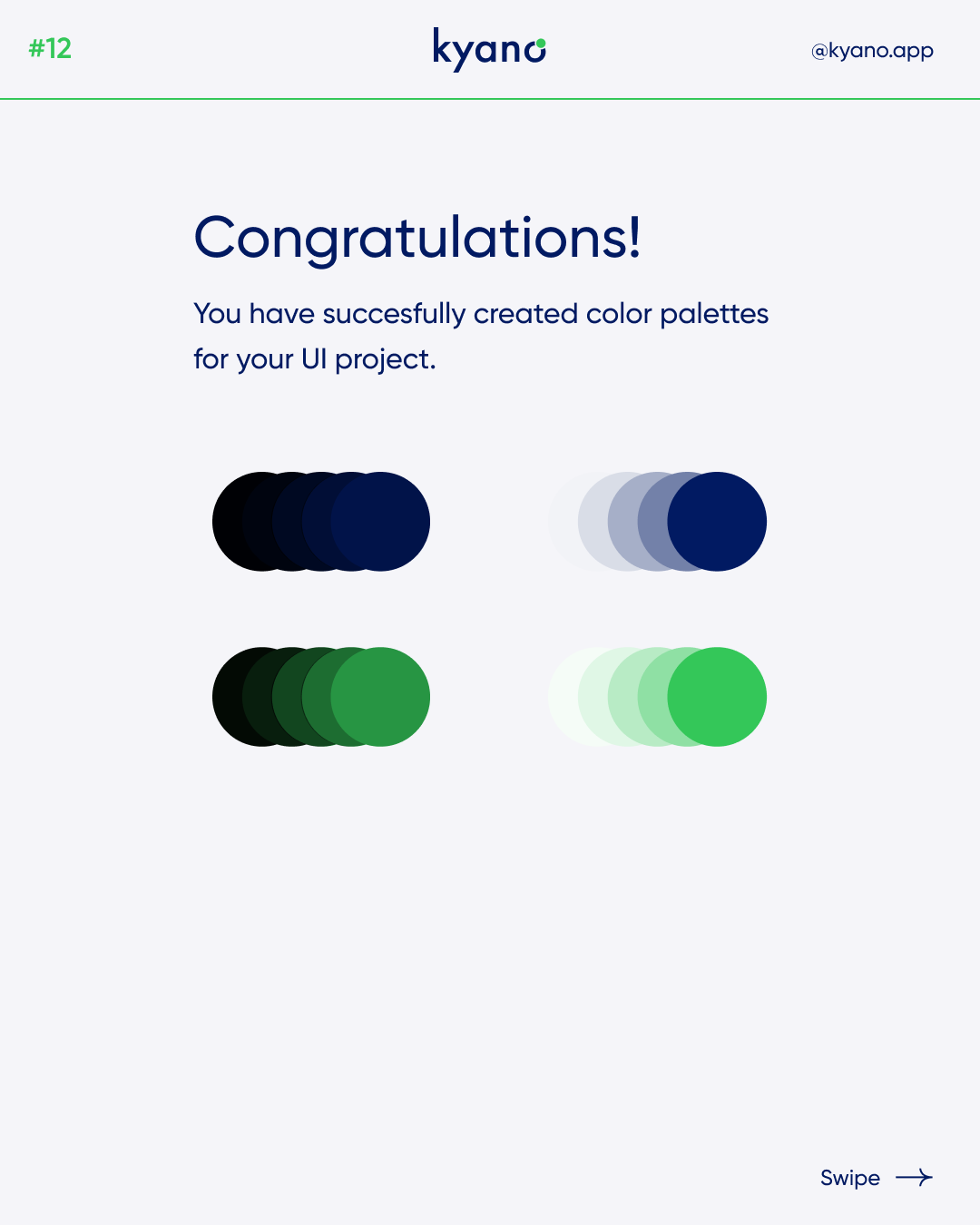
Now we have successfully created a color palette for the UI project.
Check out our Instagram for more such tips and tricks. With Kyano, you will learn to design and program properly!
Or check out our post about Dark mode design.