
How to design Dark Mode
What is Dark Mode?
Dark mode (also called night mode or lights-out mode) is a type of user interface with an altered color scheme. Such contrast may resemble a negative in photography. It has dark background colors and light foreground, light text and elements on a darker background.
Whether it is a mobile device, desktop application or even a smart TV, you can find the dark mode option here too. Large companies such as Google and Apple have already incorporated it into their interfaces. Nor can we forget about social networks such as Twitter or YouTube.
These are the guidelines to achieve a good user experience (UX design) when creating a dark theme. Here some tips for dark mode design, its advantages, and drawbacks.
How to design Dark Mode
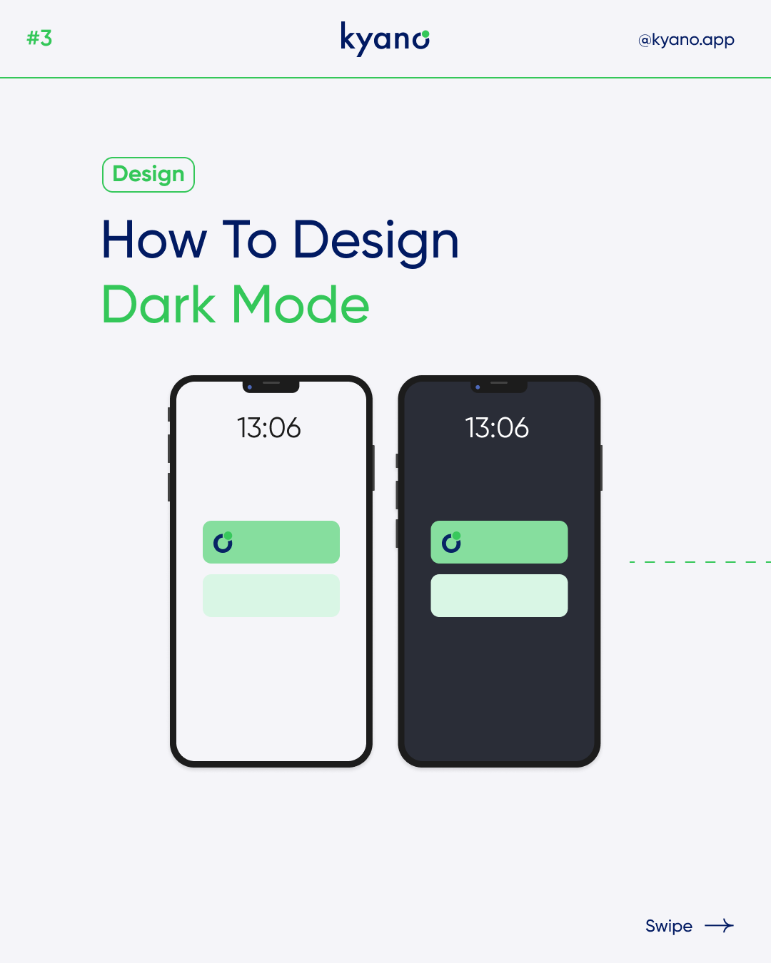
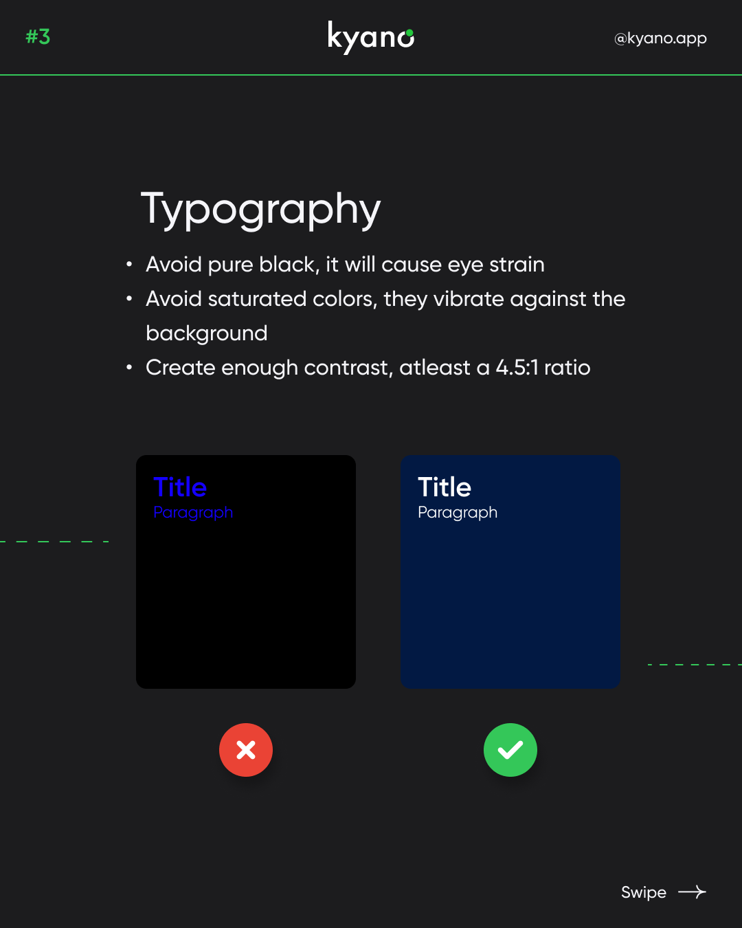
Pure colors are those that have no gray in their “mix”. A couple of examples are white (#FFFFFF) and black (#000000). They are a temptation when creating dark themes because beginner designers may think that dark theme is just putting the black background and white text. But too high contrast will end up being an eyesore between the content and the background. So use a darker version of gray to reduces irritated eyes if you design dark mode.
Saturated colors visually vibrate against a dark background. The light modes take into account the accessibility of buttons, icons, and texts. It is more difficult to calibrate the colors on dark backgrounds and not to use a palette that is too “neon” (which will only make legibility difficult). We have to take into account that when designing an interface in dark mode any type of color will stand out much more than in other circumstances.
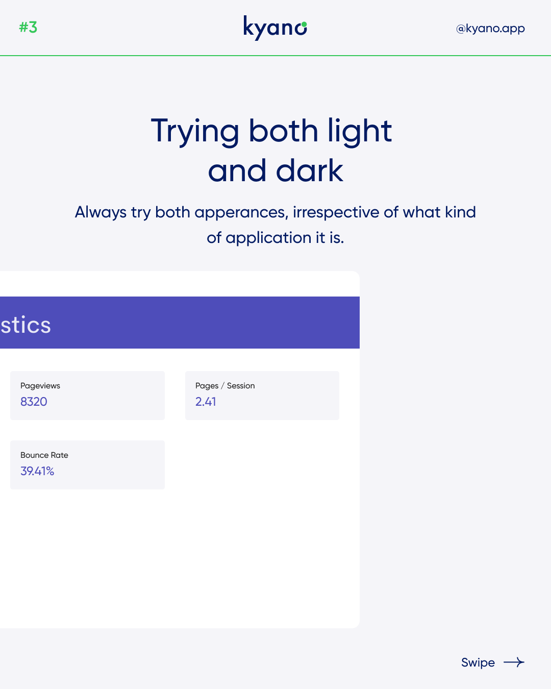
Always try both apperances, irrespective of what kind of application it is. If you are going to design dark mode you have to play with the colors. Find out what colors look good with your design. Keep in mind that the brand identity is do not get lost when designing in dark mode. The user must still recognize your brand
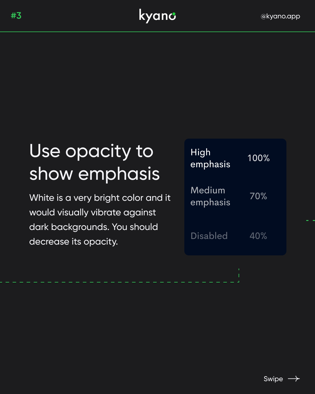
White is a very bright color and it would visually vibrate against dark backgrounds. You should decrease its opacity. When going for wihte fonts, try to choose dim white and light gray colors. According to Google, 38%, 60%, and 87% opacity of light gray are the ideal values for disabled, medium-emphasis, and high-emphasis texts.
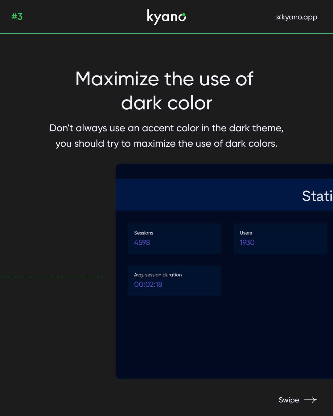
Don’t always use an accent color in the dark theme, you should try to maximize the use of dark colors.
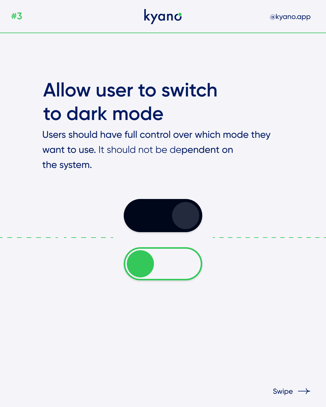
Users should have full control over which mode they want to use. It should not be dependent on the system. Give the user the ability to use your website or app how they want. Don’t let your own preferences take over
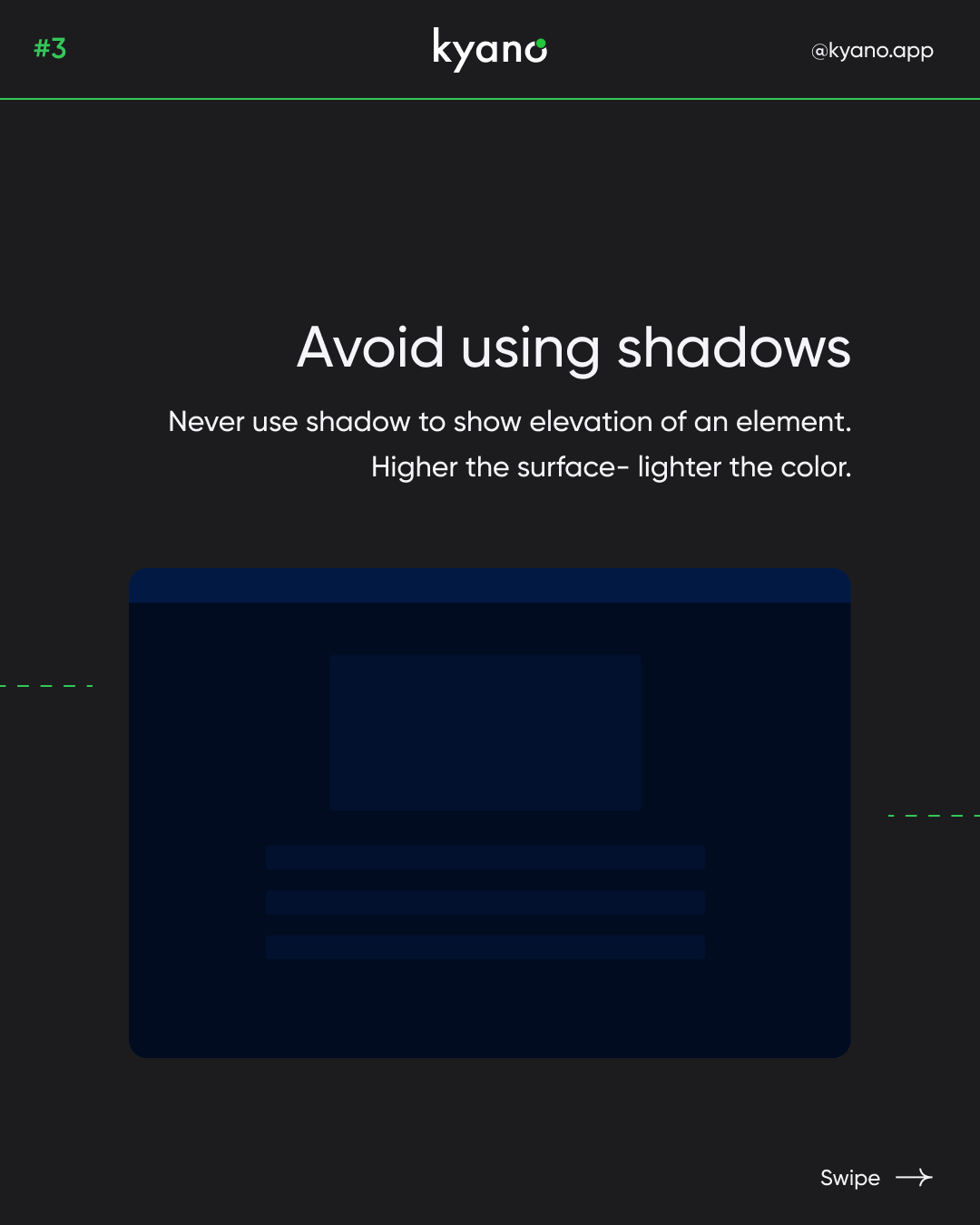
The main use of shadows in a UI is to create a small elevation effect, so we can easily detect where the content is and what is background. In a light theme, it’s all smooth sailing because a white background and a black shadow get along very well. But what happens in a dark theme? Black background and a black shadow will not have much contrast
Want to learn more? Check out our Instagram or read our other articles about design.