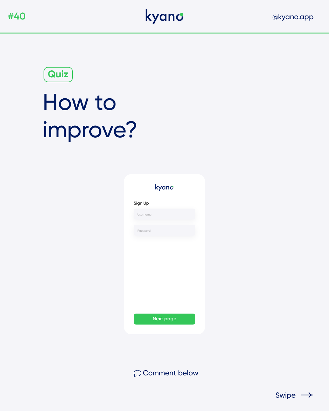
How to improve your website layout
In today’s digital world, a website is often the first interaction customers have with a business. A poorly designed website layout can lead to confusion, frustration, and a loss of potential customers. That’s why it’s essential to pay close attention to website layout, including the use of whitespace, font sizes, and hierarchy.
Improving Website Layout
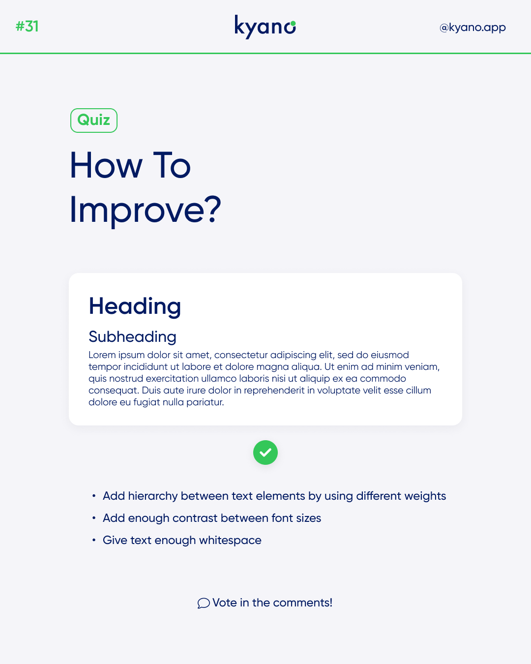
Whitespace
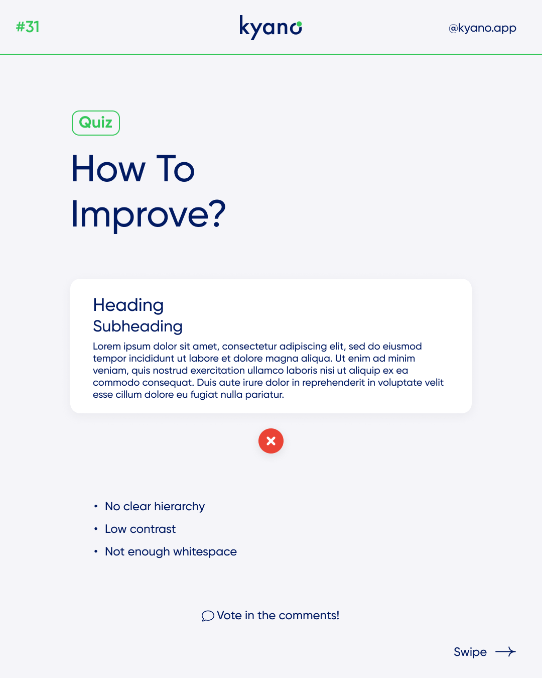
Whitespace is the empty space around design elements, such as text, images, and videos. It can be used to create a sense of balance, focus attention on important content, and improve readability in your website layout. In fact, research has shown that using whitespace can increase comprehension by up to 20%.
To use whitespace effectively, consider the following tips:
- Use ample whitespace between paragraphs, headings, and images to create a sense of separation and help readers easily distinguish between different sections of your website.
- Use whitespace to draw attention to important content, such as calls to action (CTAs), by giving them more space and making them stand out from other elements.
- Avoid cluttering your website with too many design elements, which can make it look chaotic and overwhelming. Instead, use whitespace to create a clean and simple layout that is easy to navigate.
Font Sizes
Font size plays a crucial role in website layout design. It affects readability, accessibility, and the overall look and feel of your website. To ensure your website is easy to read and visually appealing, consider the following tips:
- Use a font size of at least 16px for body text to ensure that it’s easily readable for most people. However, keep in mind that different fonts can appear differently at different sizes, so test and adjust as needed.
- Use larger font sizes for headings to create hierarchy and help readers quickly scan your website for important information.
- Avoid using too many different font sizes on your website, as it can make it look cluttered and confusing. Instead, stick to a consistent font size hierarchy throughout your website.
Hierarchy
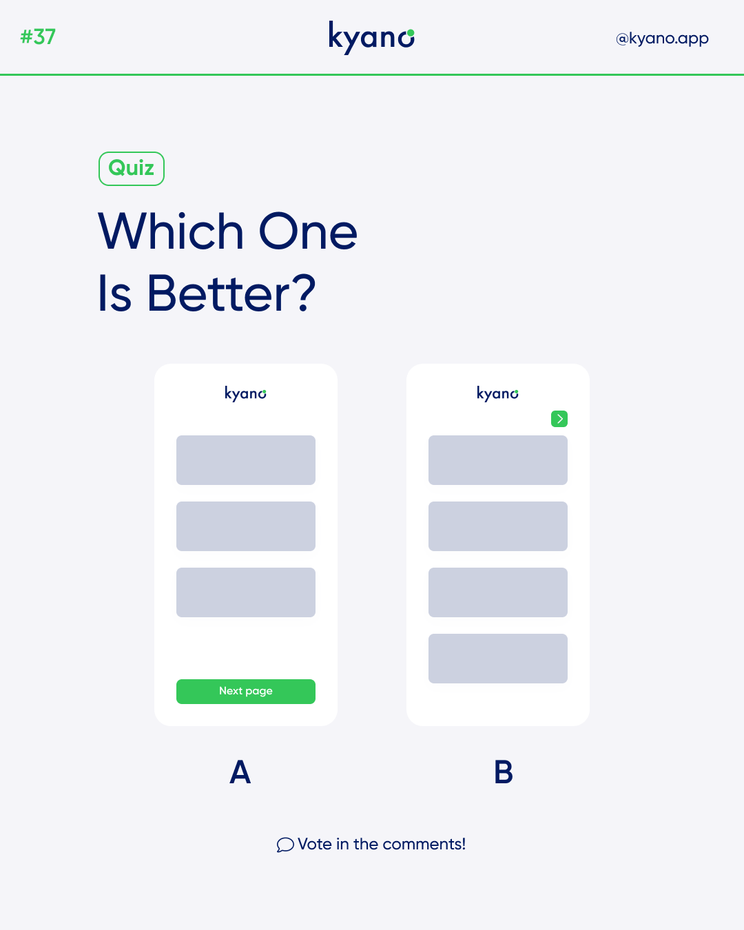
Hierarchy refers to the way content is organized on your website, with more important information given greater emphasis. Creating a clear hierarchy helps readers quickly understand the most important information on your website and navigate to the content they need. Consider the following tips:
- Use a clear and consistent heading hierarchy throughout your website. For example, use H1 headings for main page titles, H2 headings for section titles, and H3 headings for sub-sections.
- Use typography, such as bold, italic, or underlined text, to add emphasis to important words or phrases.
- Use color to create a visual hierarchy, with more important elements, such as CTAs, in bold or bright colors.
In conclusion, a well-designed website layout is critical for creating a positive user experience and driving conversions. Using whitespace, font sizes, and hierarchy effectively can help improve your website’s readability, accessibility, and overall visual appeal. By paying close attention to these design elements, you can create a website that is easy to navigate, engaging, and effective in achieving your business goals.
Do you want to learn about design? Check our blog about the best YouTube channels to learn UX/UI Design.
For example, the YouTube channel Careerfoundry!