Date-of-birth design- 2 ways
Design
16 januari 2023
#25
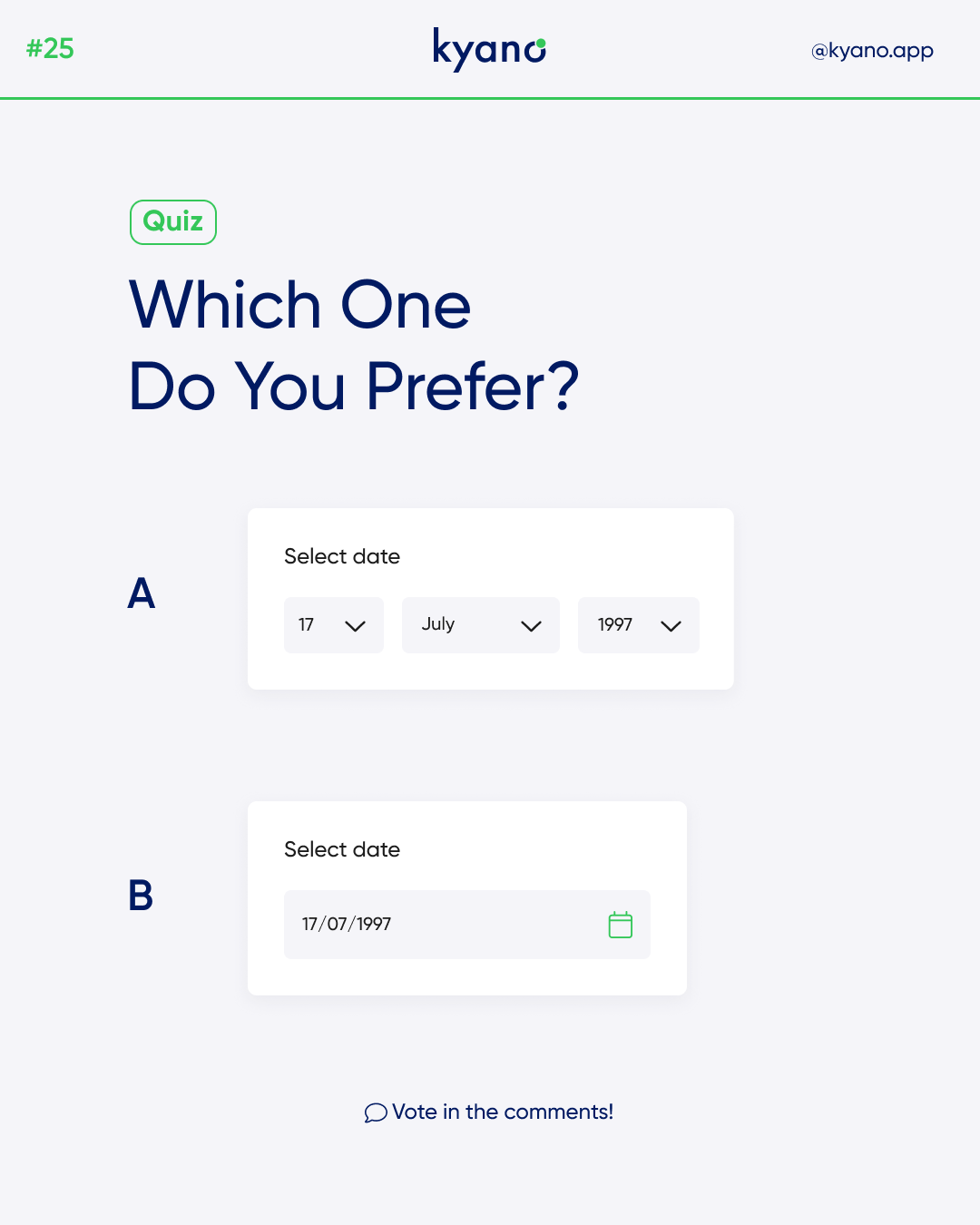
There are endless possibilities to design your date of birth form field. Like the phone number field, the birthdate is a complicated field to design because there are too many formats and controls to choose from. There are two common examples date-of-birth designs in this post.
Date-of-birth design
Asking users for their birthdate on a form is complicated. Birthdates have various formats depending on the country that consist of three separate data strings. It’s easy to confuse and frustrate users if the date-of-birth design field doesn’t use simple controls and isn’t in a clear format.
Let’s take a look at the first date-of-birth design.
Option A allows the user to scroll between a list of numbers, months and years. Once you fill in the three rows, you have the correct date of birth. Sometimes the birthdate field is spelled out with Month, Day, and Year labels. While this is less confusing for users, it can be difficult if the user has to scroll through three different select menus.
Let’s take a look at the second date-of-birth design.
Option B allows the user to look up their date of birth in a calendar. They can click on their birthday when they land on the right tab. On rare occasion, you’ll find a calendar widget like this being used to select a birthdate. This is complex for users because they have to click tiny arrow buttons to select the year and month. Since most birthdays aren’t near the current year, users will have to click that button a lot.
In addition to entering a date of birth, users must also vaan accept the terms and conditions on your website or app. Learn how to do that properly through our blog on terms and conditions.
