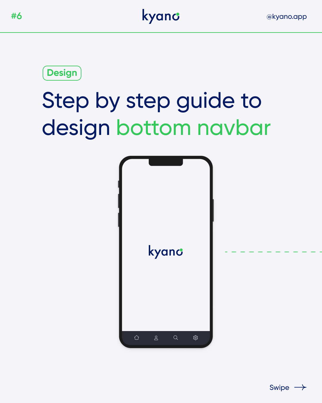

How to design bottom navbar- 4 steps
Designing the bottom navbar is an important step. The navbar is important to easily guide users through your app or website. Read how to properly design a bottom navbar in this blog:
What is a bottom navbar?
Designing the navbar is a crucial aspect of creating a user-friendly and intuitive app or website interface. The bottom navbar serves as a key navigational element, allowing users to easily explore and switch between top-level views. Properly designing the bottom navbar ensures that users can effortlessly access important destinations within your application.
A bottom navbar, also known as a bottom navigation bar, is a user interface component typically found in mobile applications or responsive websites. It is a navigation element positioned at the bottom of the screen, allowing users to easily access and switch between top-level views or sections of an app or website.
The bottom navbar typically consists of multiple items, which can be represented by text labels, icons, or a combination of both. These items serve as clickable links or buttons that users can interact with to navigate to different sections or perform specific actions within the app or website.
The primary purpose of a bottom navbar is to provide quick and convenient navigation options, making it easier for users to explore and switch between different screens or functionalities of the application. By placing the navigation options at the bottom of the screen, it ensures that they are easily accessible with one-handed use on mobile devices.
Bottom navbars are commonly used in scenarios where an application has three to five top-level destinations or sections that need to be readily available to the user. They offer a compact and intuitive navigation solution, especially on smaller screens where vertical space is limited.
When designing a bottom navbar, it is important to consider factors such as the number of items to be displayed, the visual hierarchy, iconography, and the overall user experience. The design should prioritize clarity, ease of use, and visual consistency with the overall app or website design.
Steps to design a bottom navbar
To effectively design a bottom navbar, it is essential to follow a few key steps. Let’s explore these steps in detail:
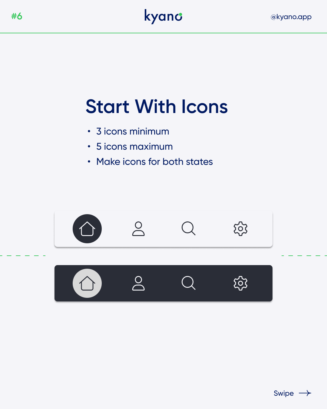
1. Start with icons:
Icons play a vital role in the visual representation of navigation elements. Choose a minimum of three icons and a maximum of five icons for your navbar. Ensure that you select icons that are clear, recognizable, and suitable for both light and dark modes.
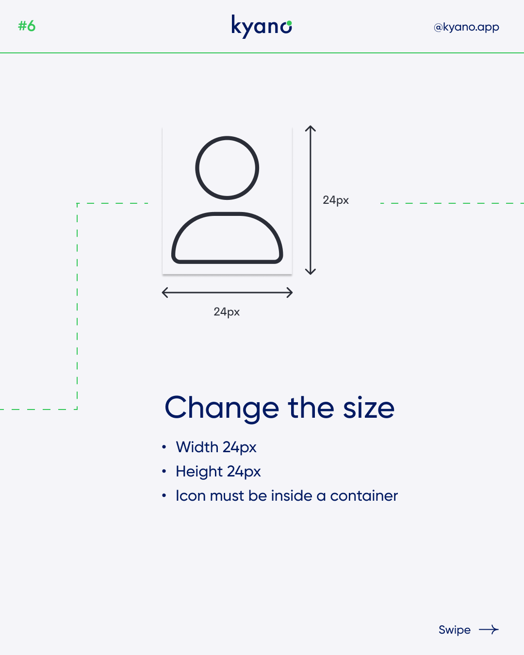
2. Change the size:
When incorporating icons, it is important to adjust their size appropriately. Generally, a width of 24 pixels and a height of 24 pixels are recommended. Remember to place each icon within its respective container for proper alignment.
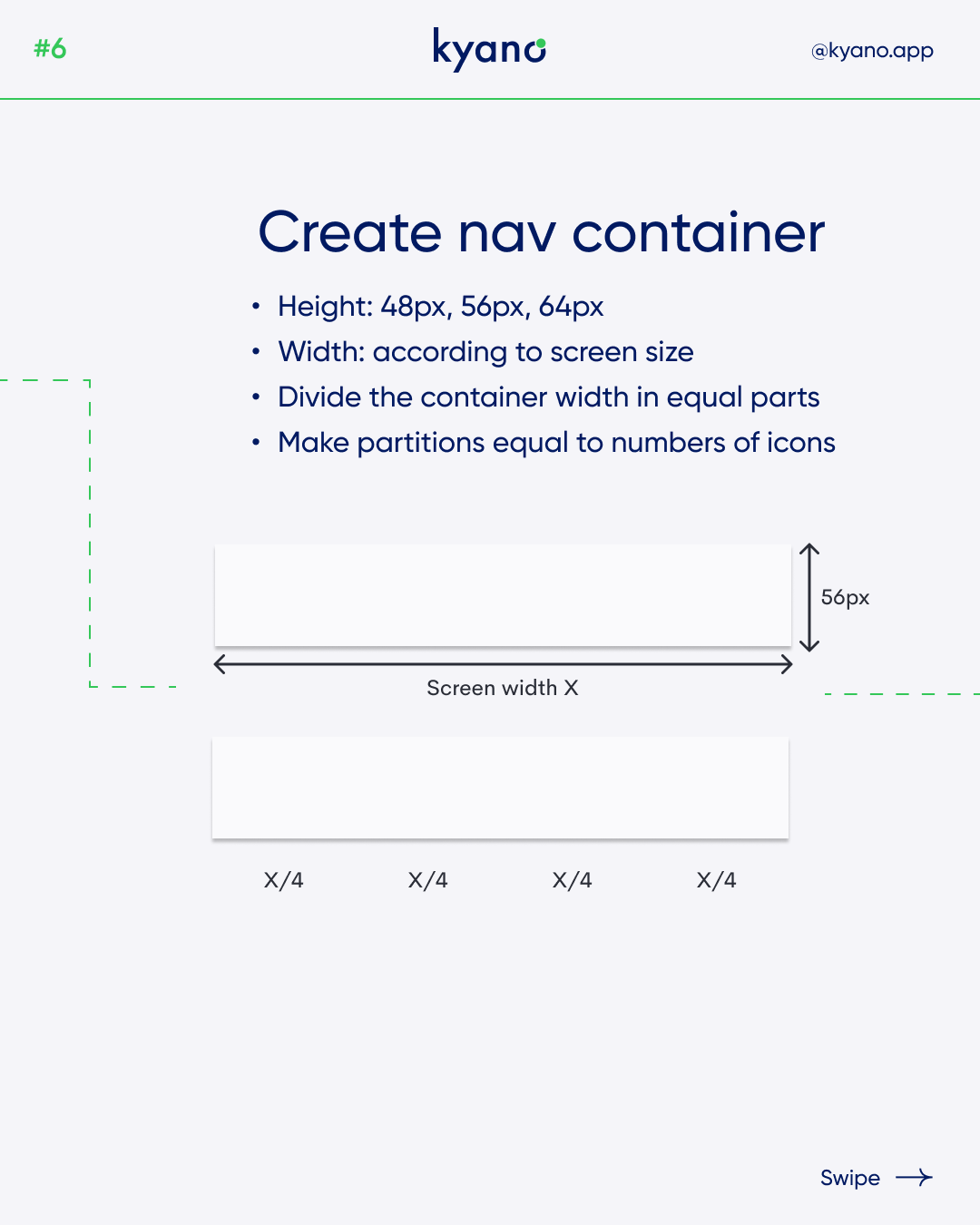
3. Create a nav container:
The nav container serves as the foundation for your bottom navbar. Determine the height of the container, which can typically range from 48 pixels to 64 pixels, depending on your design requirements. The width of the container should be proportional to the screen size. Divide the container’s width into equal parts, ensuring that each partition corresponds to the number of icons you have selected.
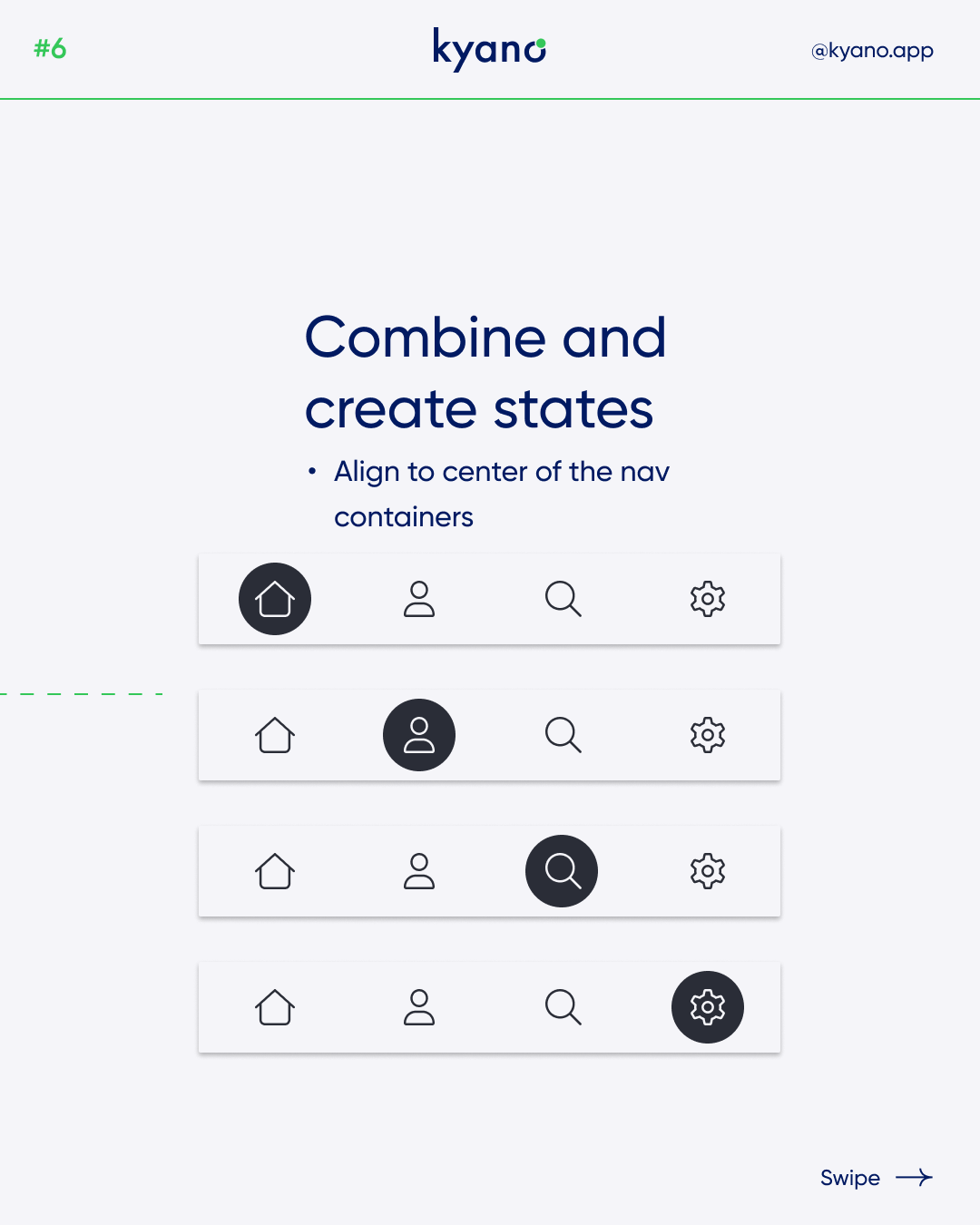
4. Combine and create states:
To achieve a cohesive and visually appealing bottom navbar, it is important to align the icon group at the center of each nav container partition. This alignment ensures consistency and balance in the design. Additionally, consider creating different states for the navbar, such as highlighting the active icon or providing visual feedback when a user interacts with a particular icon.
Want to learn more? Check out our Instagram or read our other articles about design.