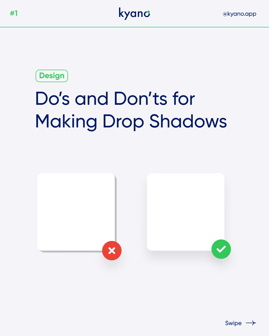

3 Do’s and Don’ts for making Drop Shadows in Web design
Drop Shadow in Web Design
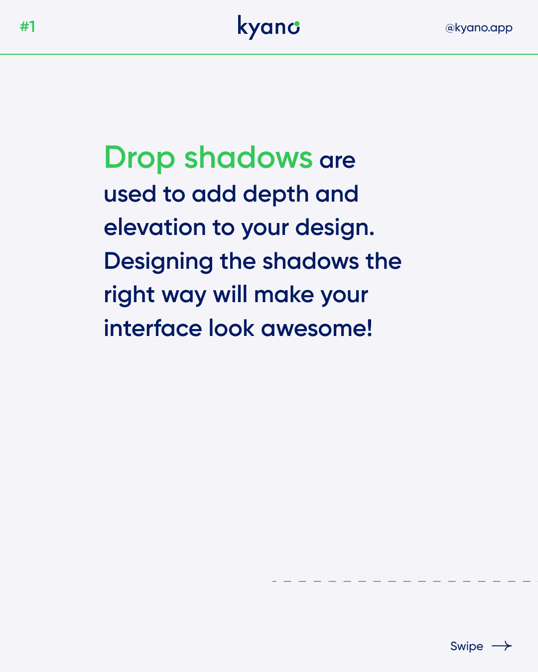
Drop shadows in web design are a popular visual effect that can enhance the overall look and feel of a website. By creating a copy of an object in black or gray and positioning it slightly differently, drop shadows give the illusion of the object casting a shadow.
The primary purpose of drop shadows in web design is to add depth and elevate objects above the elements behind them. They also serve to differentiate text from other items when placed on a colored background. By using drop shadows strategically, designers can create visually appealing interfaces.
When should you use drop shadows in web design? Drop shadows can be applied to various graphical user interface elements, such as text, menus, or windows. For instance, desktop icons often have a drop shadow on their text labels, effectively highlighting the text and making it stand out from the background. Typically, this involves drawing a black or gray area underneath the object and positioning it slightly differently.
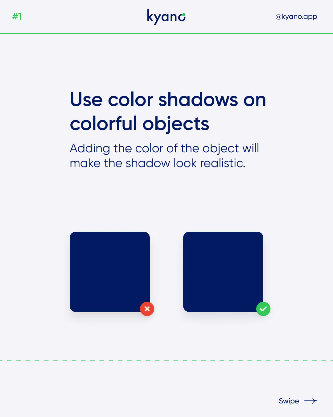
To achieve a more realistic effect, designers can experiment with techniques that go beyond simply using gray shadows. One approach is to darken the pixel colors where the shadow is cast, rather than making them uniformly gray. This can be done by alpha blending the shadow with the space where it is cast. Another method involves softening the shadow’s edges by adding a Gaussian blur to its alpha channel before blending.
Furthermore, inset drop shadows can be employed to create the illusion of sunken or recessed elements within the shadow. This technique adds an extra layer of depth to the interface.
Do’s and Don’ts for Drop shadows in web design
To ensure your drop shadows in web design are effective, there are some do’s and don’ts to consider:
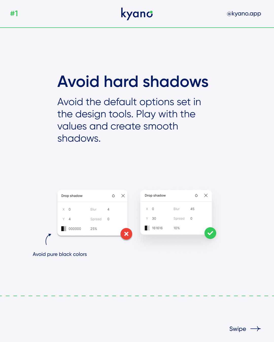
1. Avoid hard shadows: Refrain from using default options in design tools. Experiment with different values to create smooth and natural-looking shadows. Instead of using pure black, opt for darker shades that complement your design’s color palette. Shadows in real life are not black; they are darker versions of the objects they fall upon due to reduced light. Adjust the opacity according to the blur value and color to achieve the desired effect.
2. Consider light direction: Think about the direction of the light source. Adjust the Y value of the shadow to create the impression that the light is coming from above the object and casting the shadow. By mimicking real-world lighting effects, drop shadows and gradients can convey information about metaphorical objects, imaginary light sources, and their relationships.
3. Don’t overuse shadows: Avoid the temptation to apply drop shadows excessively. Certain elements, such as outlines and disabled buttons, may not benefit from shadows and could even detract from the overall design. Instead, explore alternative methods like gradients and varying shades of the same color to convey depth and hierarchy. A combination of different techniques can lead to visually striking and well-rounded interfaces.
Incorporating these tips will help you create appealing drop shadows in your web design projects. Remember to consider the light direction, avoid hard shadows, and use drop shadows judiciously. By doing so, you can enhance the depth and visual appeal of your interfaces. By mastering the art of drop shadows in web design, you can bring a sense of dimension and realism to your interfaces, captivating users with visually captivating designs that stand out from the crowd. Don’t hesitate to explore various techniques and experiment with different shadow values to achieve the perfect balance of depth and elegance in your web design projects.
For more inspiration and examples of drop shadows in web design, feel free to check out our Instagram page, where you can learn more about this technique and its implementation. Want to learn more? Read our other articles about design.