How to make Call-to-actions in web design?
When it comes to formatting your design, the possibilities are truly limitless. However, it’s crucial to exercise caution and ensure that your design doesn’t inadvertently create confusion or miscommunication. This applies particularly to the formulation of your call-to-actions (CTAs). CTAs are integral elements within your designs that guide users towards desired actions, and how you present them can greatly impact their effectiveness.
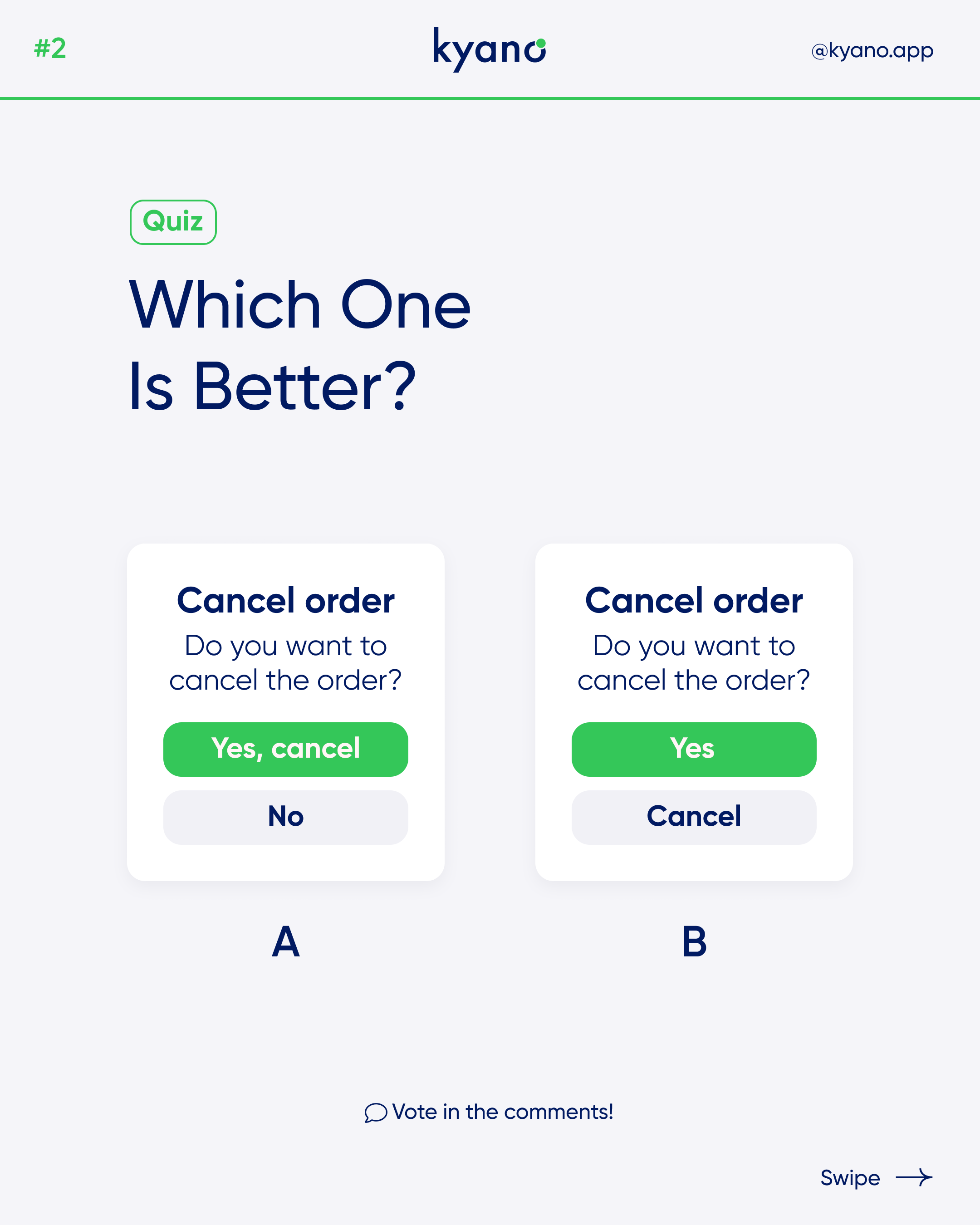
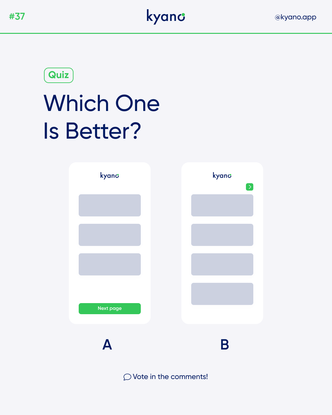
Which call-to-action is better?
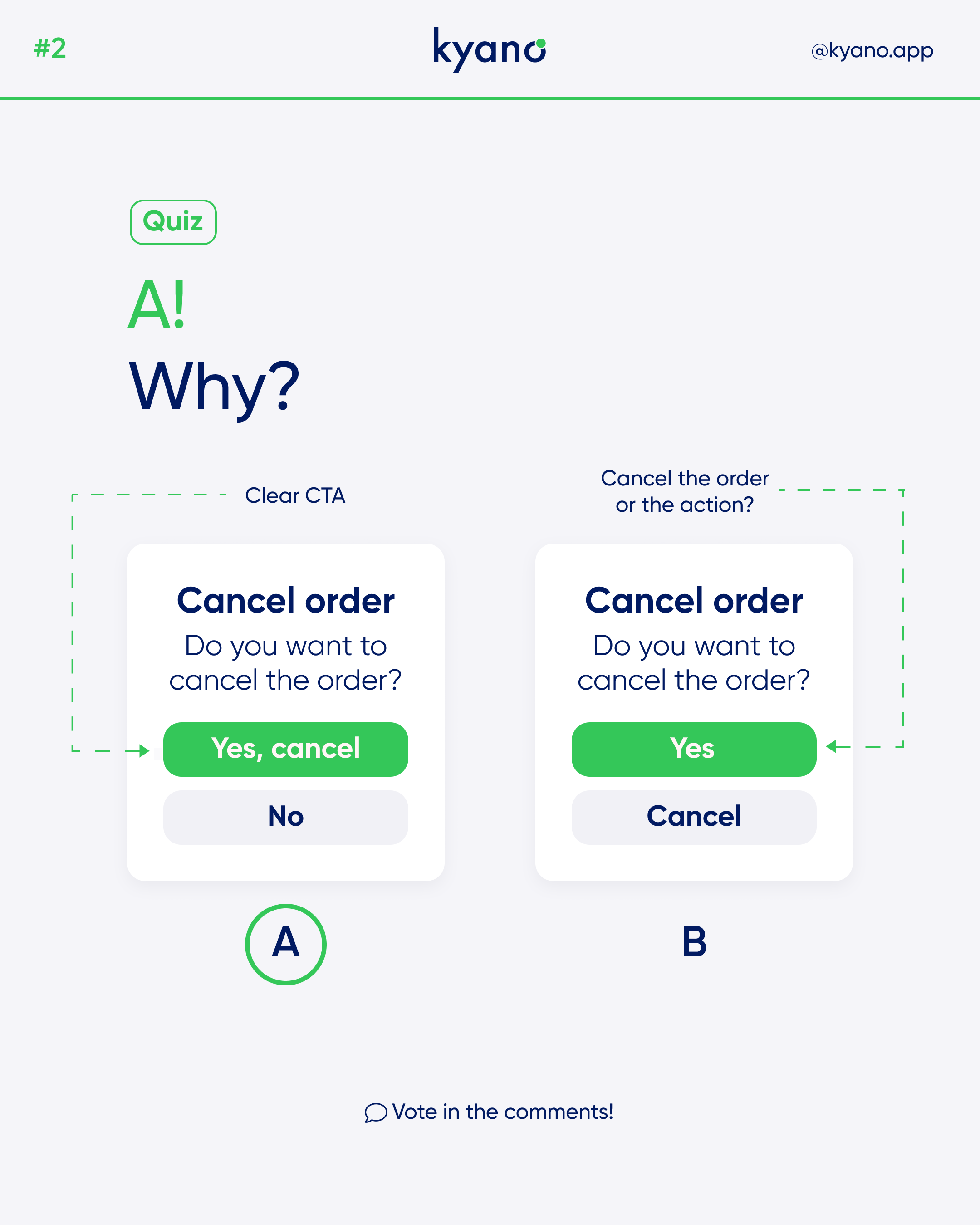
When evaluating different design options, it becomes evident that design A is the most optimal choice. By implementing design A, you effectively mitigate any potential confusion that may arise among users of your app or website. The inclusion of a clear and actionable verb, such as “cancel” in this example, within the call-to-action further enhances user understanding and guides them towards the specific action they need to take. As a result, design A not only prioritizes user clarity but also empowers them to navigate your interface with confidence and ease.
Call-to-actions
Call-to-action in web design — and in user experience (UX) in particular — is a term used for elements in a web page that solicit an action from the user. The most popular manifestation of call to action in web interfaces comes in the form of clickable buttons that when clicked, perform an action (e.g. “Buy this now!”) or lead to a web page with additional information (e.g. “Learn more…”) that asks the user to take action.
Call-to-actions (CTAs) are crucial elements in web design and user experience (UX) that play a pivotal role in engaging and motivating users to take specific actions. CTAs can take various forms, but the most common and effective manifestation is clickable buttons that prompt users to perform desired actions or explore further information.
The primary purpose of Call-to-actions is to guide users through their journey on a website, encouraging them to complete specific tasks or conversions. Well-designed CTAs help create a clear path for users, directing them towards important actions that align with the website’s goals and objectives.
Key Principles
When creating CTAs, it is important to consider a few key principles:
1. Clarity: CTAs should communicate a clear and concise message to users, instantly conveying the desired action. Whether it’s “Buy Now,” “Sign Up,” or “Download,” the language and design of the Call-to-actions should leave no room for confusion.
2. Visual Distinction: CTAs should stand out from the rest of the page’s content, making them easily noticeable and enticing to users. Color contrast, size, and placement are essential in drawing attention to the CTA and making it visually appealing.
3. Placement and Hierarchy: CTAs should be strategically placed within the user’s visual flow, ensuring they are easily discoverable without overwhelming the overall design. Additionally, consider their hierarchy based on the importance and priority of the actions they represent.
4. Compelling Copy: The text used in CTAs should be persuasive and compelling, encouraging users to take immediate action. Experiment with different wording and language styles to find the most effective approach for your target audience.
5. Responsiveness: Ensure that Call-to-actions are optimized for various devices and screen sizes. They should be easily clickable and responsive, providing a seamless user experience across different platforms.
6. A/B Testing: To maximize the effectiveness of CTAs, conduct A/B testing to compare different designs, placements, and wording variations. This iterative process allows you to fine-tune and optimize your CTAs based on user engagement and conversion metrics.
By implementing well-designed and strategically placed Call-to-actions, you can significantly increase user engagement, conversions, and overall success of your website or digital product. Remember to continually analyze user behavior, adapt to evolving trends, and refine your CTAs to continuously improve the user experience and achieve your business objectives.
Want to learn more? Read our other articles about design.
