4 common Design mistakes
Throughout this comprehensive blog, we will not only delve into the most common design mistakes but also offer practical solutions and valuable insights to help you elevate your project to perfection. By avoiding these pitfalls and implementing effective design strategies, you can ensure a successful delivery of your new design project, impress your clients, and create a memorable user experience.
4 common design mistakes
Let’s discuss four common design mistakes. When you read this you are going to see it reflected in many websites. You want to avoid these design mistakes to provide the best user experience for your website or application.
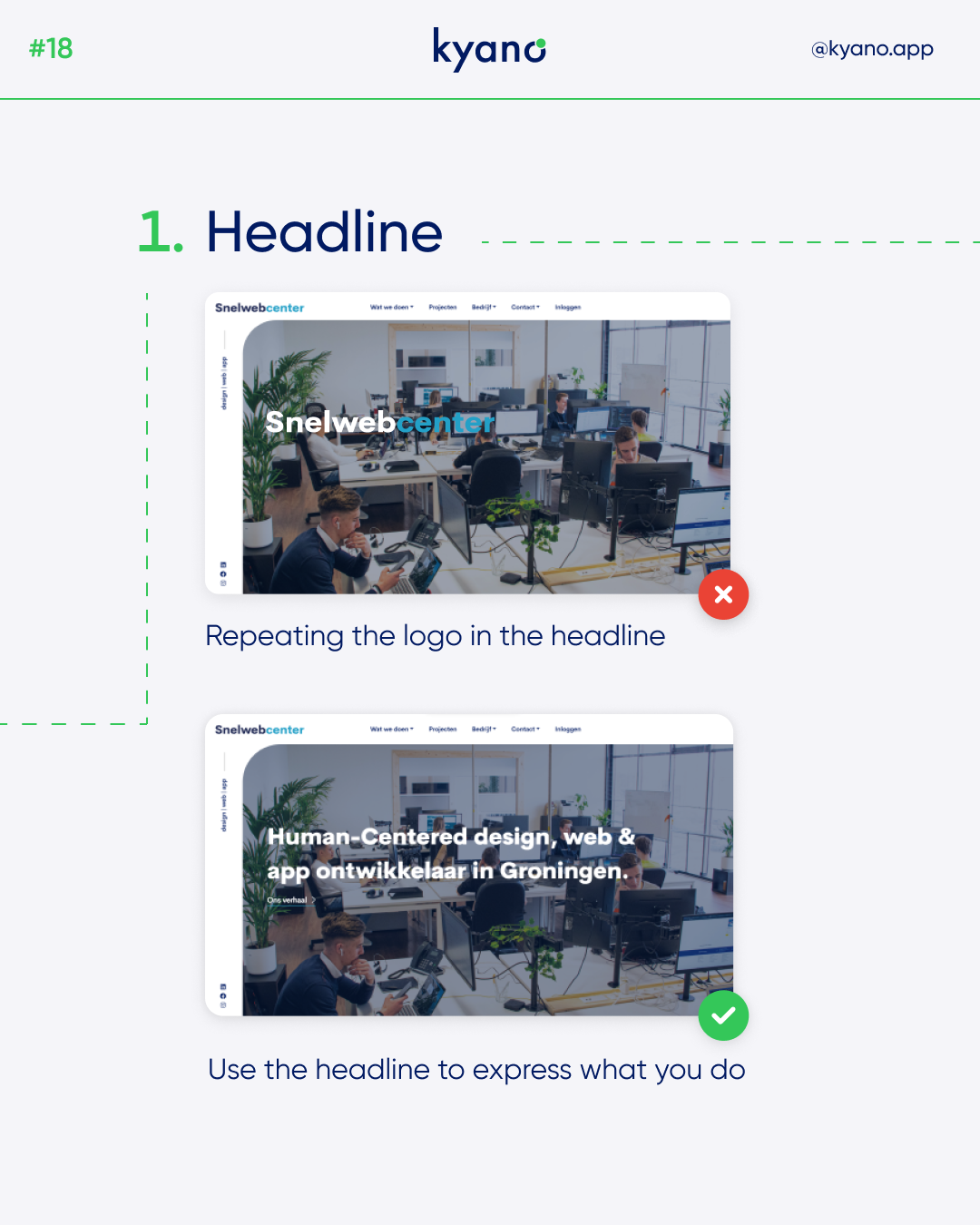
Mistake #1: Inadequate Headline Placement
One prevalent design mistakes is duplicating the logo on the homepage. For optimal impact, it is advisable to prominently display your logo at the top of the screen. Instead of repeating it unnecessarily, utilize the middle section of the page to succinctly and effectively explain your business and its offerings. By doing so, you captivate the user’s attention while providing them with a clear understanding of your brand and purpose.
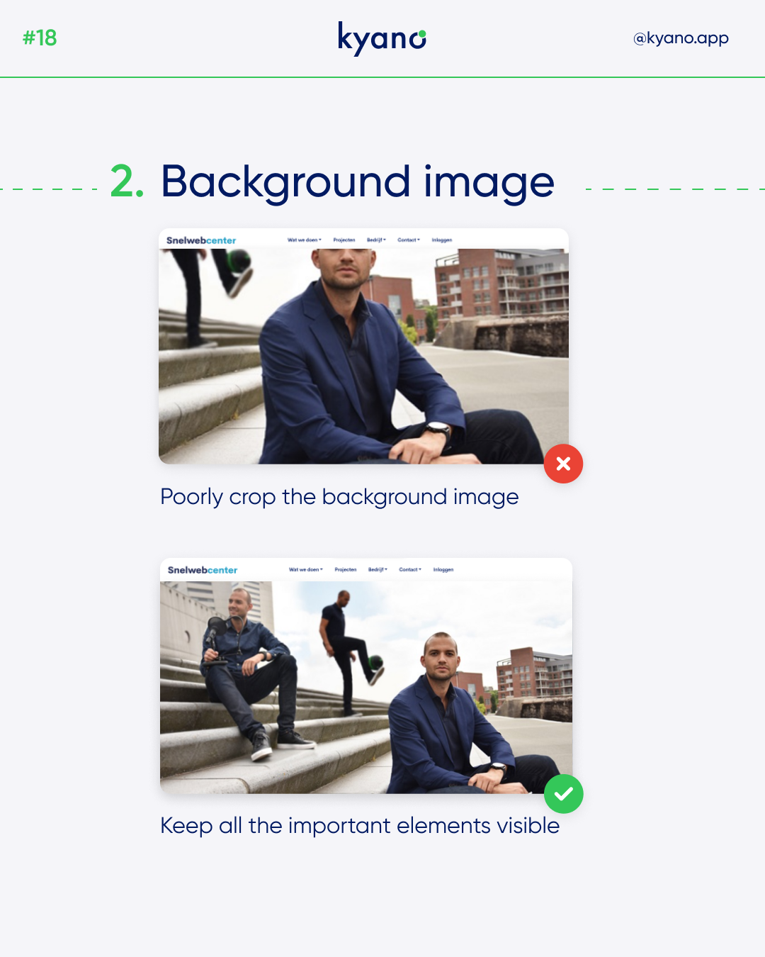
Mistake #2: Flawed Background Image Presentation
When incorporating images on your website, it is vital to ensure they are displayed clearly for the users’ benefit. Avoid cropping images in a way that eliminates important elements or hampers comprehension. By presenting complete visuals that showcase all the relevant components, you enhance the user experience and facilitate their engagement with your content. Remember, a visually appealing and well-presented background image can significantly contribute to the overall aesthetic appeal of your website.
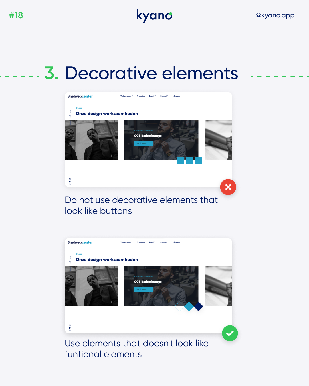
Mistake #3: Misuse of Decorative Elements
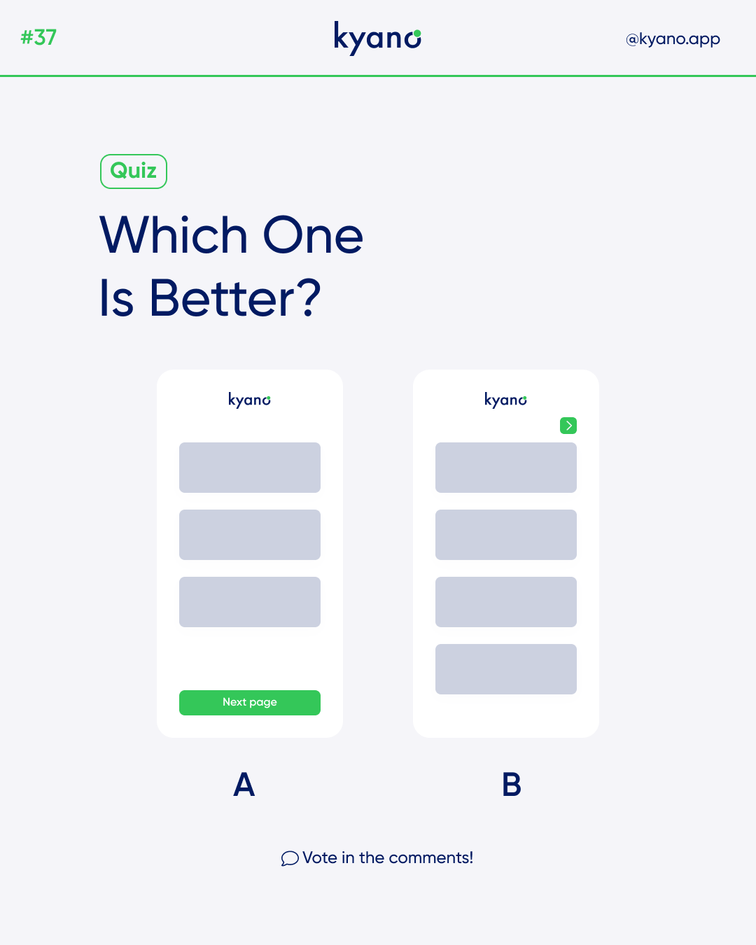
To prevent user confusion or oversight, it is crucial to avoid incorporating decorative elements that resemble functional buttons or interactive components. This can lead to user frustration and hinder the seamless navigation of your website. Instead, opt for design elements that are visually distinct from functional elements. By implementing clear differentiators, users can easily identify actionable buttons or interactive features, enhancing the overall usability and user-friendliness of your design.
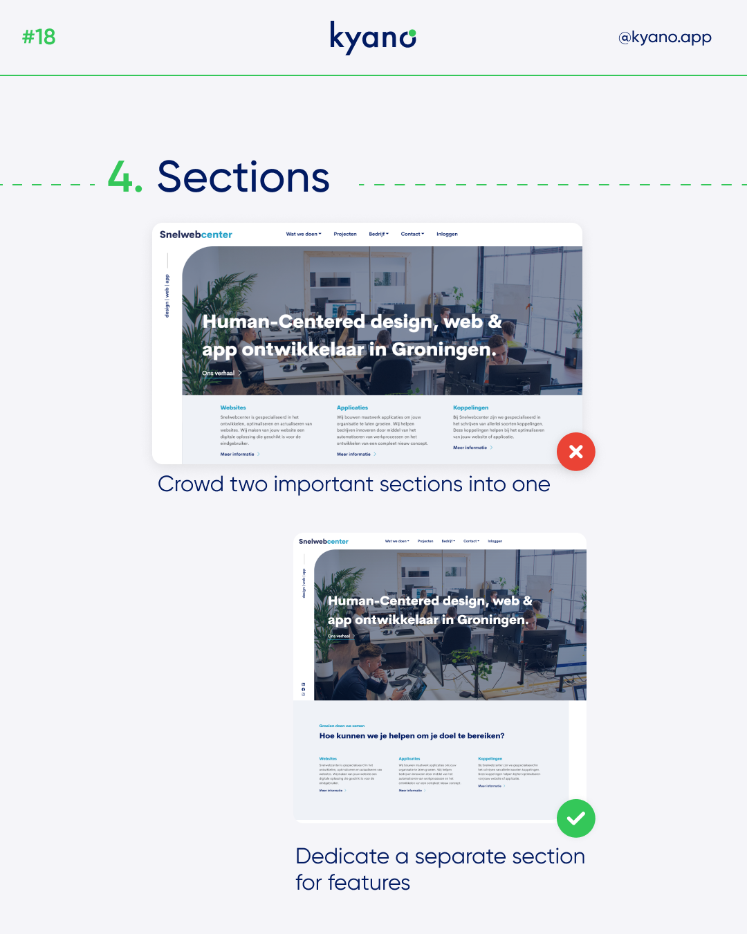
Mistake #4: Neglecting Section Differentiation
Every part of your website deserves its moment to shine. By avoiding the mistake of placing crucial information or important sections in the same location, you allow each element to stand out independently. Divide your webpage into distinct sections that appropriately highlight different aspects of your content. This segmentation facilitates easy navigation and comprehension for users, enabling them to absorb and interact with your website in a more organized and intuitive manner.
By addressing these common design mistakes and implementing the corresponding solutions, you can elevate your design project to new heights of excellence. Remember, an effective design is one that captivates users, communicates your brand’s message clearly, and provides a seamless user experience. By paying attention to crucial elements such as headline placement, background image presentation, decorative elements, and section differentiation, you can create a visually appealing and highly functional website that effectively meets your clients’ objectives.
In conclusion, strive for perfection in your design projects by avoiding these common mistakes and implementing best practices. By continuously refining and improving your design skills, you can deliver outstanding results that impress your clients and delight users. Stay attentive to the details, ensure clarity in your visual communication, and prioritize the user experience at every step of the design process. Remember, a flawless design is a testament to your expertise and dedication, leaving a lasting impact on both your clients and their target audience.
