8 Common HTML mistakes to avoid (part 2)
HTML (HyperText Markup Language) is the backbone of every website. It provides the structure and content of the website. However, there are some common HTML mistakes that can harm the website’s usability and accessibility.
Common HTML Mistakes
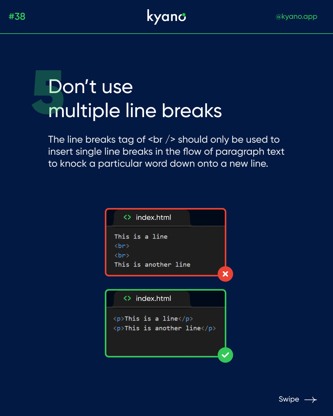
Don’t use multiple line breaks
Multiple line breaks create unnecessary white space between paragraphs and headings, making the website look unprofessional and cluttered. Instead, use CSS (Cascading Style Sheets) to control the spacing and layout of the website. By doing this, you can keep the content clean and consistent across all devices.
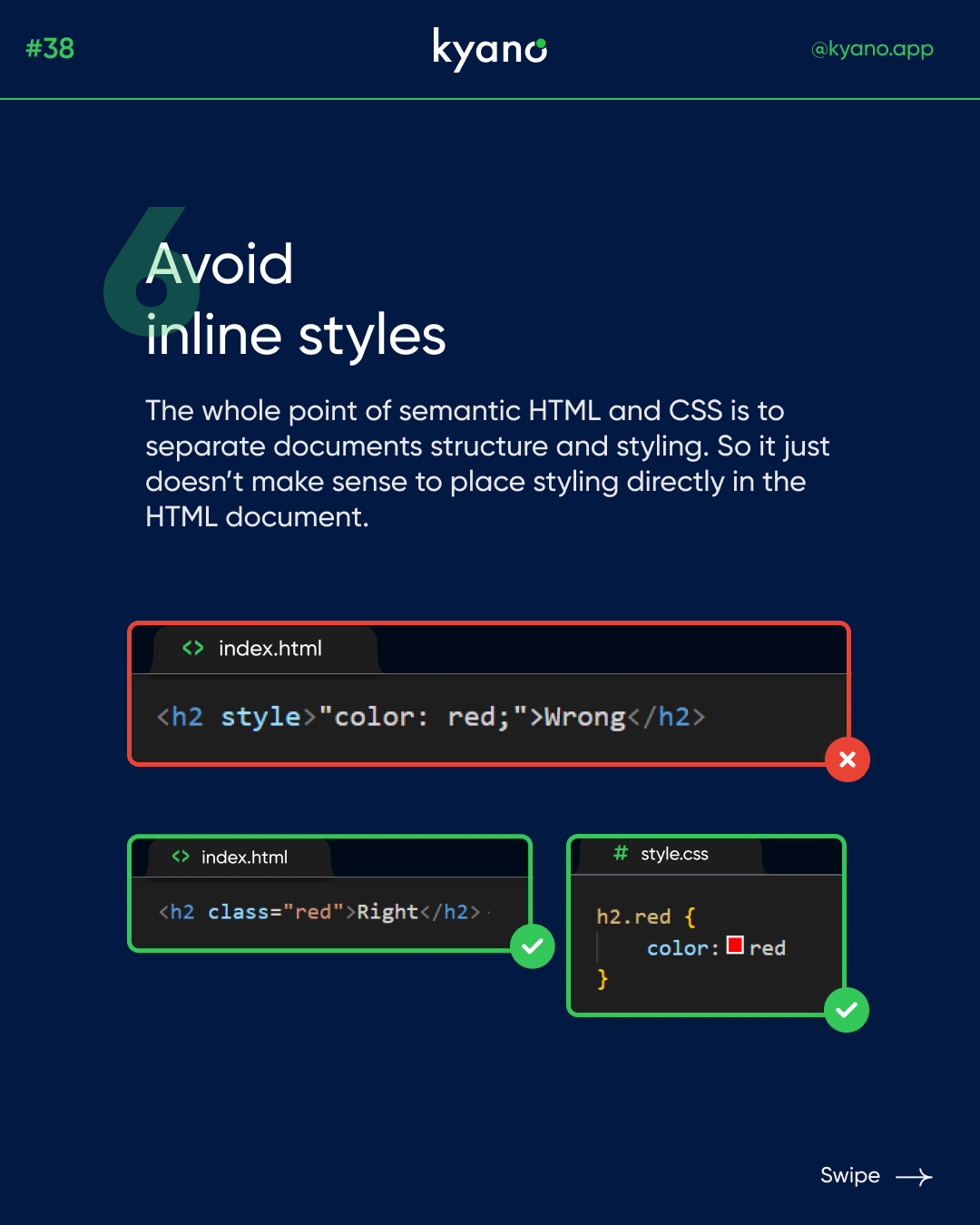
Avoid inline styles
Inline styles refer to CSS styles that are applied directly to HTML elements. While inline styles may seem convenient, they make it challenging to maintain consistency across the website. Instead, use external style sheets to keep the design consistent and easy to manage.
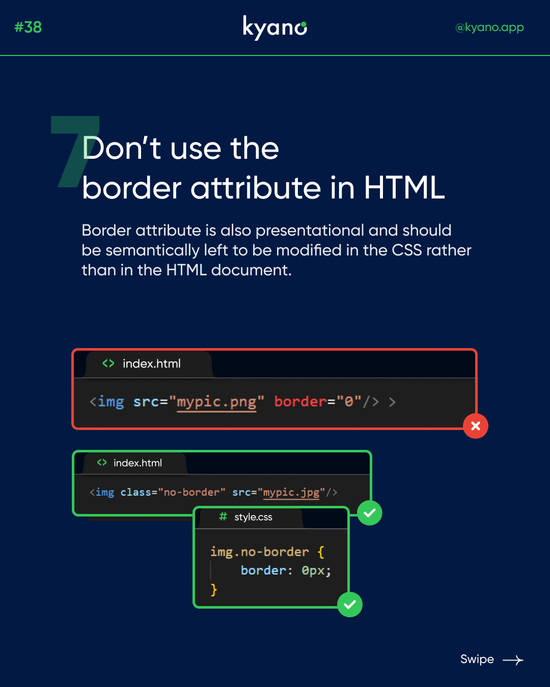
Don’t use the border attribute in HTML
The border attribute is used to add a border to an HTML element. However, this attribute is outdated and not recommended. Instead, use CSS to add borders to elements. By doing this, you can control the style and appearance of the border, including its thickness, color, and style.
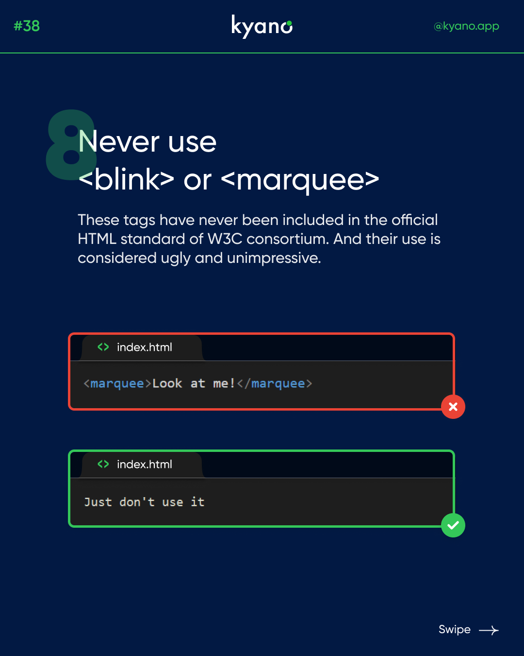
Never use <blink> or <marquee> tags
The <blink> and <marquee> tags were popular in the early days of the web to create flashy, eye-catching animations. However, they are no longer recommended for use because they can distract and annoy users. Instead, use CSS animations or JavaScript to create more subtle and effective animations.
In conclusion, by avoiding these common HTML mistakes you can create a clean, consistent, and user-friendly website that meets the needs of your audience.
Go to part one to learn more about the common HTML mistakes or go to our Instagram.
